I think I mentioned previously that I'm talking to an Illustration Agent. They've been pretty positive (but a tad hard to pin down), and based on my portfolio, they're pretty keen to work with me.
While they like my cartoony-skills, it's the style I did that "Bevvies" piece in that they're particulary interested in.
So they gave me a test.
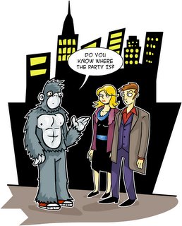
The Brief: A cartoon showing a man dressed up in a gorilla costume questioning a very perplexed smartly dressed young couple on the streets of New York: a speech bubble coming from the Gorilla with the words: "Do you know where the party is".
(this is for a kids educational manual- or something)
It's a small paying gig, so the agent told me not to spend too much time on it.
This is what I turned in:

(clicking on image will open it up in another window at proper size)
After 3 years working in kids animation, this has become my natural style- espically for a quick turn around.
But the feed back I got from the Agent was it was too cartoony. He said the market is flooded with that kind of style. So with that in mind, I've had another crack at it:

(clicking on image will open it up in another window at proper size)
I haven't sent it off yet as I'm still unsure about it. I was using it to test some photoshop textures, but I'm in two minds about it. Have I over done it? It's hard trying to get the results I want with the technology at hand.
I was told years ago by a creative director- "Don't let the software dictate what you do. Work out what you want to do first, and then use your tools to achieve it."
Feed back appreciated.


3 comments:
Textured one looks TOPS; maybe play with the background colour and opacity to push it back a little further (IF whatever arcane graphiques software you're using allows such things...)
Maybe add some 'NYCish' neon signs to push that element of the brief, too.
The cropping of the legs looks a little bit weird, but- a wider shot like the first one'd nail that issue.
Again- LOVE that one!
That is all.
Hey Scotty nice work...
SO I am no artist etc, but my first question is, who are the audience? if it is young people, exactly what groups etc....the first has a really nice visual clarity - it kind of is immediate, the second I like for its more subtle facial expressions and background but they are both effective according to your audience - play for the crowd man...thats what these geezers want - so who are the crowd??? robin ;>
Hello, Neat post. There's a problem together with your site in internet explorer, could check this? IE still is the marketplace leader and a large part of folks will omit your magnificent writing because of this problem.
my web site ... interesting article
My web site > payday loan direct lenders
Post a Comment